
excel2013如何绘制图表
发布时间:2017-05-15 15:13
在excel2013中,图表经常用于对比数据,但是应该怎么绘制出来呢?下面就跟小编一起来看看吧。
excel2013绘制图表的步骤
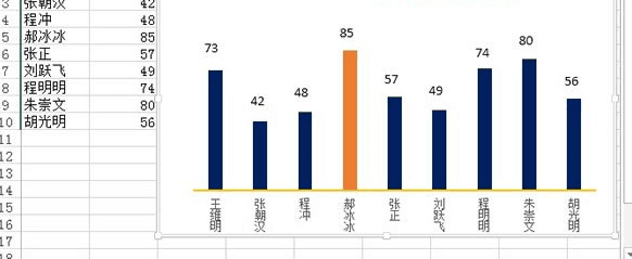
我列举的例子是班级学生考试成绩表,算出一个最高分,以不同颜色显示在图表中。表格我已经建立好,选中A1:B10,单击菜单栏--插入--图表--簇状柱形图,也就是第一个。

然后鼠标单击水平轴,右键,设置坐标轴格式。
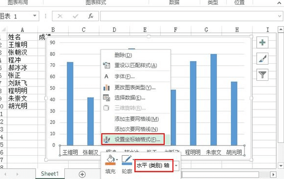
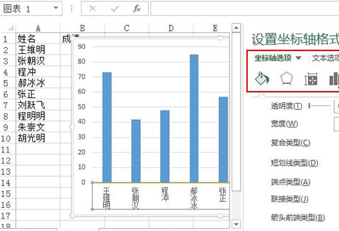
此时右侧会出现设置坐标轴格式任务窗格, “对齐方式”——文字方向:竖排。坐标轴选项——主要刻度线类型:无。线条颜色:实线:黄色。线型:宽度:1.5磅。
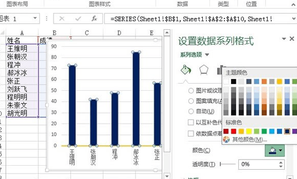
在点击柱形,就会选中所有矩形,右击,设为其他颜色。
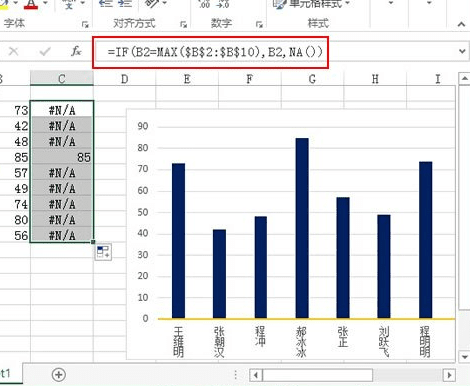
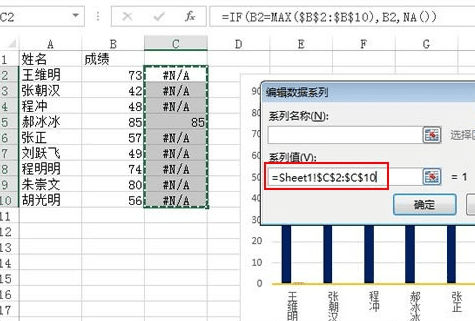
此时在C2单元格输入公式:=IF(B2=MAX($B$2:$B$10),B2,NA()),下拉填充到C10单元格。公式的意思是将B列的最大值标识出来,其余的用NA()错误值标识。
右击图表空白区域,在弹出的菜单中选择数据。
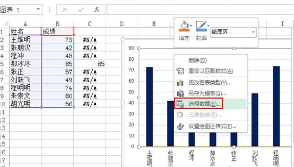
添加新数据,选择区域:C2:C10。确定。
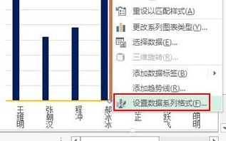
此时郝冰冰那一项会出现一个橙色的柱形,选中右击,设置数据系列格式。
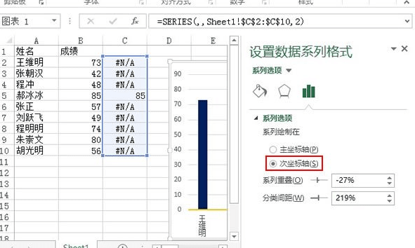
将系列绘制在次坐标轴,然后删除不需要的部件,如图表标题、图例、网格线、垂直轴等等。
添加文本框,完成最终的效果设计。
excel2013如何绘制图表的评论条评论